Improve the retention rate of a sales assistant app
Improve the retention rate of a sales assistant app
Let's see how content design helped sales teams to adopt a mobile assistant.
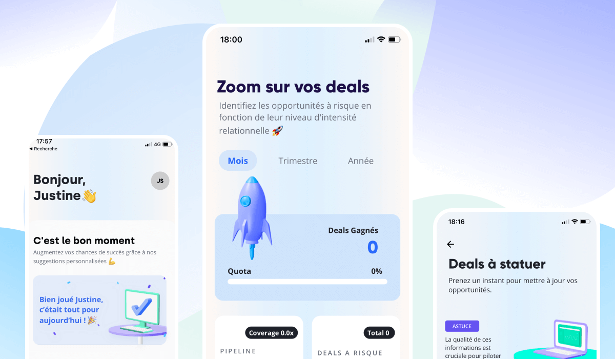

Overview
Client: EverReady
Goal: Get the application adopted by B2B sales teams
Context: In its previous version, the arrival of the application within sales teams was poorly received. Sales reps perceived the tool as a means of surveillance by managers, rather than a sales efficiency tool.
Tools : Figma, Notion, Zeplin
Stakeholders: CEO + product designer
Process
Step 1: Getting to grips with the subject
The first part of the mission consisted in understanding the reasons why the application was poorly perceived by users. To do this, here's an overview of the questions I focused on:
Who are the users?
What are their day-to-day tasks?
What tools do they work with?
How were they introduced to EverReady?
How do they feel about the tool?
After analyzing several user interview reports, it became clear that there was a misunderstanding about the value of the product. Indeed:
The product was presented as a task automation tool (e.g. updating the CRM according to the salesperson's call history), not as an assistant.
From the onboarding page, users were asked to accept access to data from their business phone without context.
The benefits to sales reps were not emphasized.
Sales reps experienced the tool as a means of monitoring by managers, which created anxiety.
Step 2: How Might We?
Next, we explored ideas to help us answer two questions: how can we demonstrate the value of the application to the sales team? How can we build trust in the product?
We decided to focus on 2 main elements:
Create a feature/benefit matrix to better explain how the application is a true assistant.
Focus on users' concerns about how their data is being used.
These elements must be addressed during the app onboarding.
Step 3: onboarding revamp
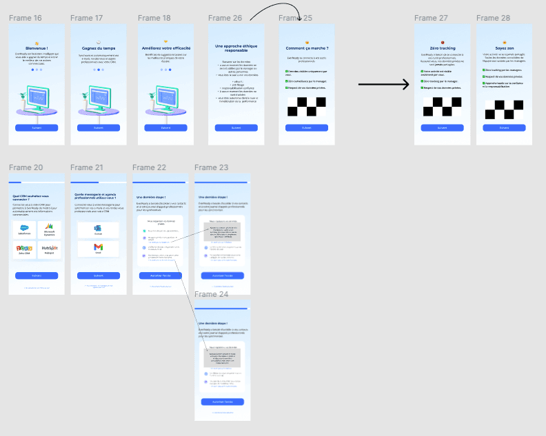
I worked on low-fidelity wireframes to define the new onboarding steps. I explained the benefits and why the app needed to connect to other sales tools.
For example, we changed "Connect your CRM tool" with "Save time with automatic CRM sync"
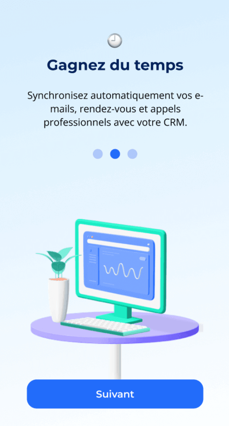
Result
The reassuring content and explanations displayed in the new version of the application helped users to better understand the value of the product. As a result, retention rates improved.
Note: Since we've been working together, the client has pivoted slightly, resulting in a new content strategy.
Overview
Client: EverReady
Goal: Get the application adopted by B2B sales teams
Context: In its previous version, the arrival of the application within sales teams was poorly received. Sales reps perceived the tool as a means of surveillance by managers, rather than a sales efficiency tool.
Tools : Figma, Notion, Zeplin
Stakeholders: CEO + product designer
Process
Step 1: Getting to grips with the subject
The first part of the mission consisted in understanding the reasons why the application was poorly perceived by users. To do this, here's an overview of the questions I focused on:
Who are the users?
What are their day-to-day tasks?
What tools do they work with?
How were they introduced to EverReady?
How do they feel about the tool?
After analyzing several user interview reports, it became clear that there was a misunderstanding about the value of the product. Indeed:
The product was presented as a task automation tool (e.g. updating the CRM according to the salesperson's call history), not as an assistant.
From the onboarding page, users were asked to accept access to data from their business phone without context.
The benefits to sales reps were not emphasized.
Sales reps experienced the tool as a means of monitoring by managers, which created anxiety.
Step 2: How Might We?
Next, we explored ideas to help us answer two questions: how can we demonstrate the value of the application to the sales team? How can we build trust in the product?
We decided to focus on 2 main elements:
Create a feature/benefit matrix to better explain how the application is a true assistant.
Focus on users' concerns about how their data is being used.
These elements must be addressed during the app onboarding.
Step 3: onboarding revamp

I worked on low-fidelity wireframes to define the new onboarding steps. I explained the benefits and why the app needed to connect to other sales tools.
For example, we changed "Connect your CRM tool" with "Save time with automatic CRM sync"

Result
The reassuring content and explanations displayed in the new version of the application helped users to better understand the value of the product. As a result, retention rates improved.
Note: Since we've been working together, the client has pivoted slightly, resulting in a new content strategy.

© Justine Sudraud – All rights reserved - 2025
© Justine Sudraud
All rights reserved - 2025