Teaching UX writing to product designers
Teaching UX writing to product designers
Introducing UX writing to junior product designers.


Overview
I had the chance to share the basics of UX writing with a class of Master 1 UX/UI students at ECV Design School (Nantes, France). Over 8 sessions, we dove into the fundamentals to craft clear and useful content. It was a delightful mix of theory and hands-on practice!
What we talked about
Here's an overview of the course:
What is UX writing;
The basic rules of UX writing;
How to know how your users speak;
Defining guidelines;
Accessibility and inclusivity;
Localization;
Intro to advanced practice for design systems.
The group project
To apply their knowledge, students worked on a group project. The theme: "How to address the aging population in France?"
From there, we conducted ideation workshops and research sessions to find a concept.
The constraint: to propose a digital solution (for the sole purpose of applying the course!)
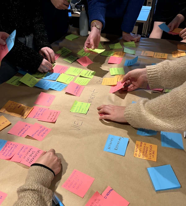
During one of the ideation workshops
This exploratory phase led to the following idea: enabling younger generations to benefit from the experience of older individuals, and vice versa. This is materialized through a fictional place and a digital interface that allows users to sign up for a course or propose one! The students named their concept "Les P'tits Potes", which can be translated as "The Little Buddies". This allows a person to offer a skill, such as cooking or knitting, and for others to participate in the class!
How about UX writing?
Students had to think and craft this project from scratch. In other words, it was perfect to put their knowledge to the test. Through workshops, the students:
Reflected on user needs in terms of information;
mapped the content in a user journey map;
defined the tone to be used;
established guidelines for their content;
defined the information hierarchy;
determined the best way to present information;
conducted tests to evaluate the content.
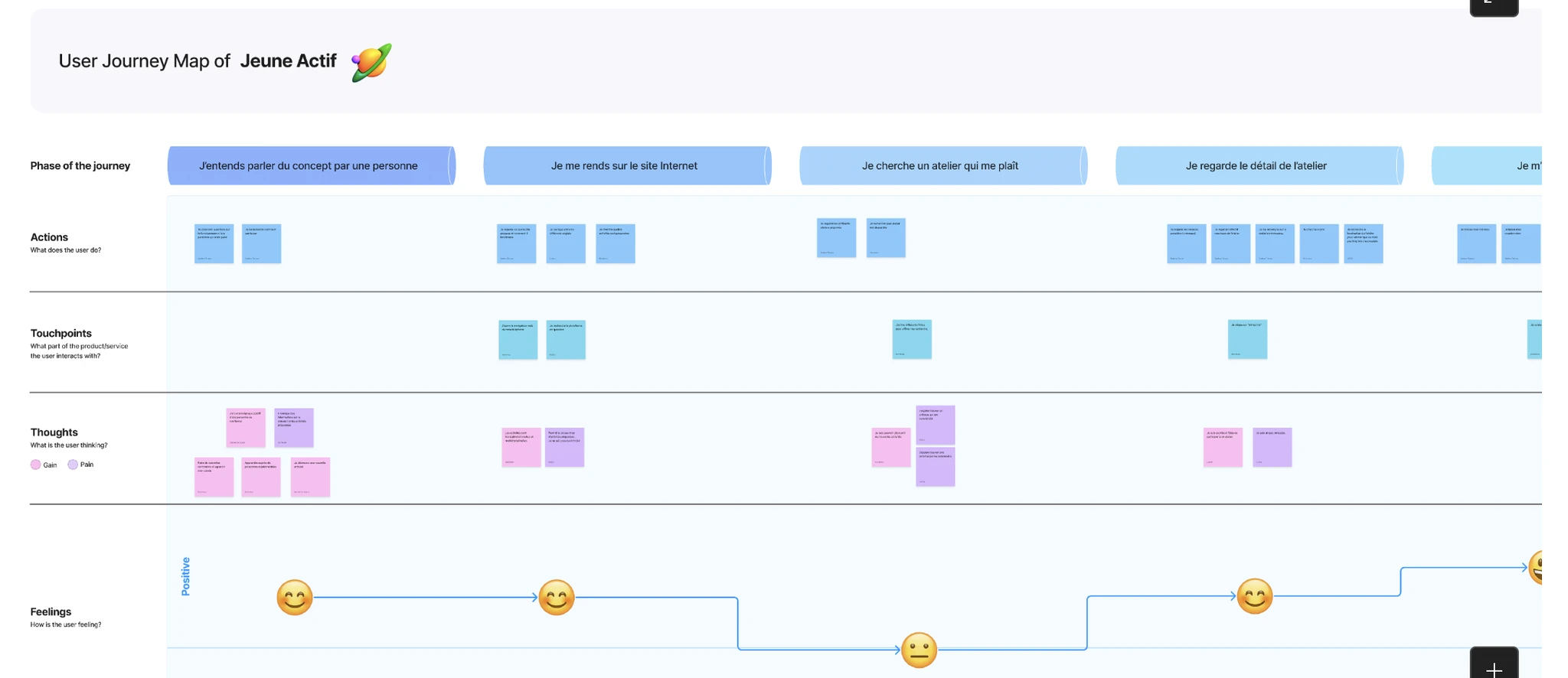
One of the user journey maps used to define information needs
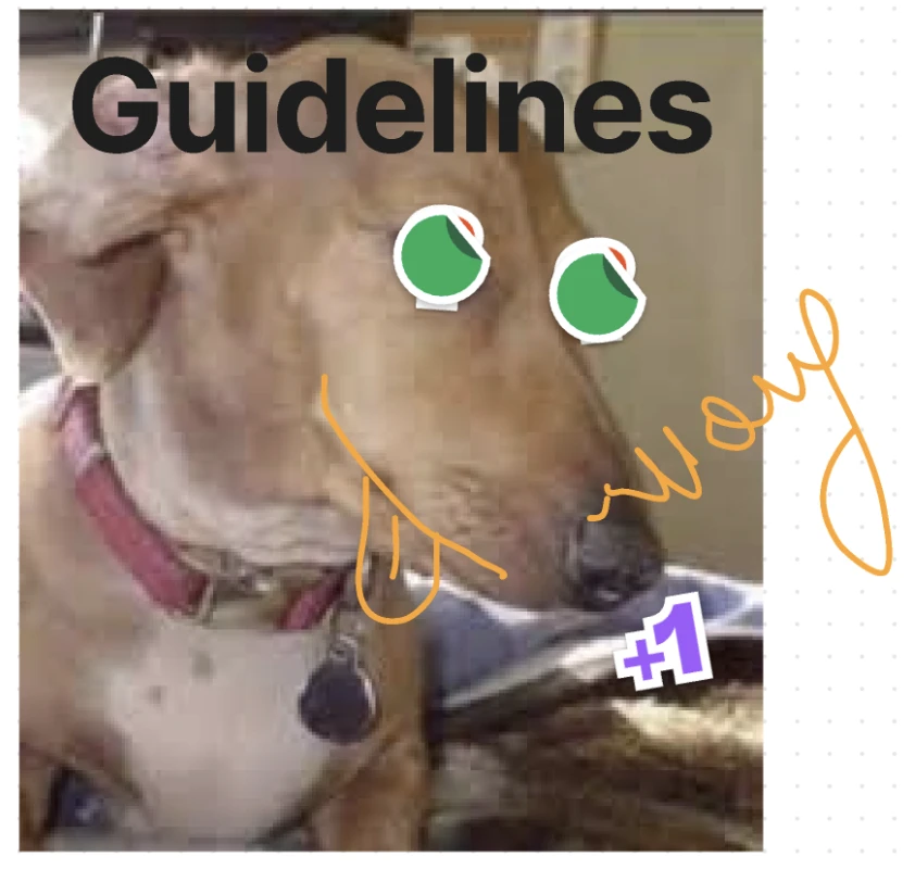
Working on Figjam sometimes leads to works of art
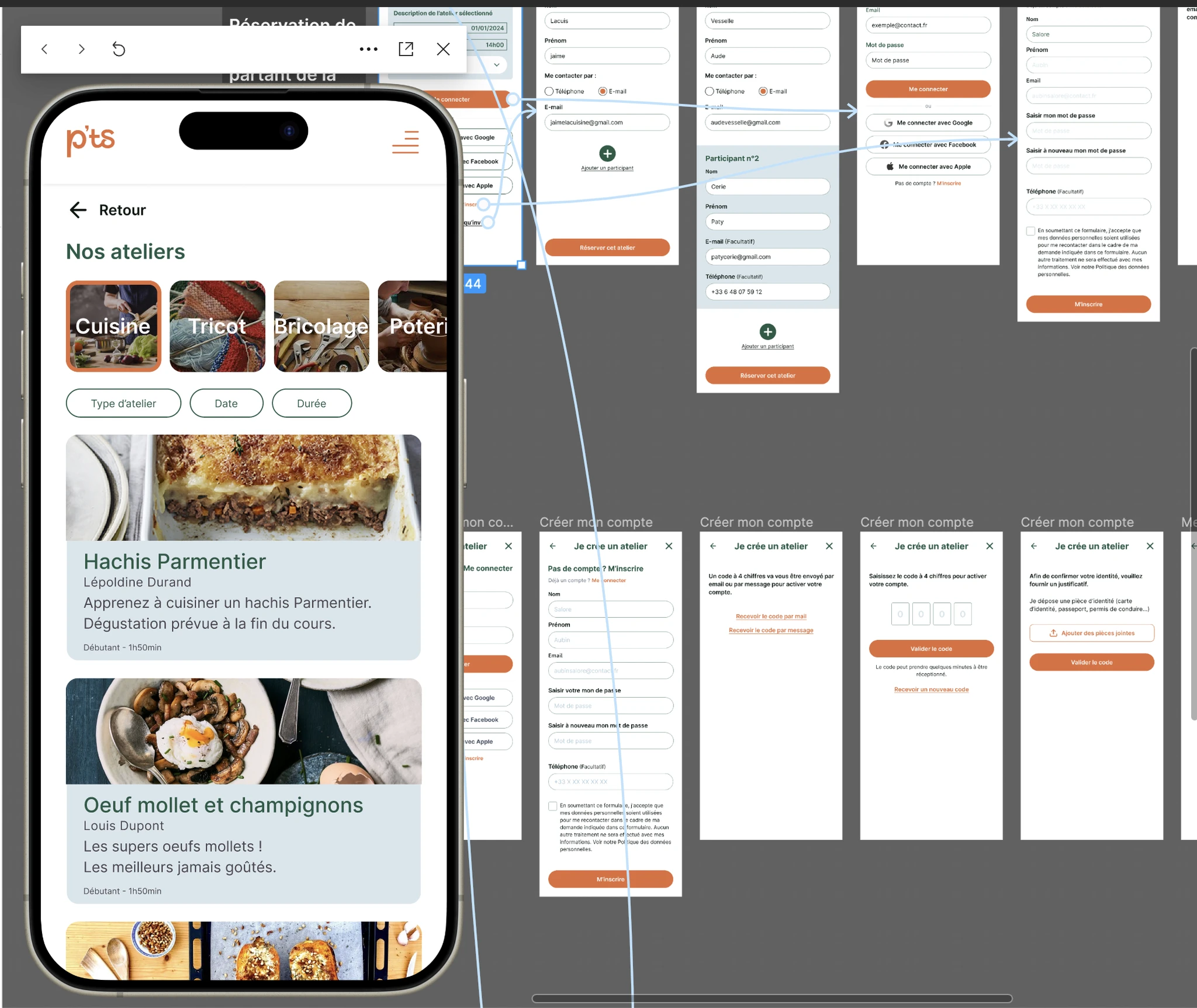
The students created an interactive prototype of their concept! Here, we see a screen that allows users to book a cooking class led by one of the association members.
Students' feedback on the course 🖤
I asked the students to answer a few questions to assess their satisfaction with the course. Here are some testimonials (translated from French):
"I understood the importance of dedicating time to content and focusing on it before wireframing."
"Since the course, I challenge myself more on content in my designs. It also confirmed to me that the ideal way to create mockups is to consider content first."
"Thinking about content first makes everything easier! Everything becomes more harmonious, both for the designer and the user."
"I appreciated your good mood and your willingness to take our feedback to improve the module. You always tried to motivate us, without reproach, even when we struggled to engage in the sessions."
Final thought
It's often said that the best way to self-assess on a subject is to teach it, and it's safe to say that it's true!
The students are working alternately in various types of companies: large corporations, SMEs, agencies, and so on. In other words, it was a very conducive environment for exchanging ideas about everyone's needs, practices, and realities.
Because not everyone has UX writers on their team (far from it), it's crucial for designers to learn good content practices. And that's something the (good) design schools have understood well!
After spending 8 Thursday afternoons together and completing a group project from start to finish, the objective has been achieved!
I'm thrilled with this experience and would gladly repeat it!
Need to train your designers? Drop me a line!
Overview
I had the chance to share the basics of UX writing with a class of Master 1 UX/UI students at ECV Design School (Nantes, France). Over 8 sessions, we dove into the fundamentals to craft clear and useful content. It was a delightful mix of theory and hands-on practice!
What we talked about
Here's an overview of the course:
What is UX writing;
The basic rules of UX writing;
How to know how your users speak;
Defining guidelines;
Accessibility and inclusivity;
Localization;
Intro to advanced practice for design systems.
The group project
To apply their knowledge, students worked on a group project. The theme: "How to address the aging population in France?"
From there, we conducted ideation workshops and research sessions to find a concept.
The constraint: to propose a digital solution (for the sole purpose of applying the course!)

During one of the ideation workshops
This exploratory phase led to the following idea: enabling younger generations to benefit from the experience of older individuals, and vice versa. This is materialized through a fictional place and a digital interface that allows users to sign up for a course or propose one! The students named their concept "Les P'tits Potes", which can be translated as "The Little Buddies". This allows a person to offer a skill, such as cooking or knitting, and for others to participate in the class!
How about UX writing?
Students had to think and craft this project from scratch. In other words, it was perfect to put their knowledge to the test. Through workshops, the students:
Reflected on user needs in terms of information;
mapped the content in a user journey map;
defined the tone to be used;
established guidelines for their content;
defined the information hierarchy;
determined the best way to present information;
conducted tests to evaluate the content.

One of the user journey maps used to define information needs

Working on Figjam sometimes leads to works of art

The students created an interactive prototype of their concept! Here, we see a screen that allows users to book a cooking class led by one of the association members.
Students' feedback on the course 🖤
I asked the students to answer a few questions to assess their satisfaction with the course. Here are some testimonials (translated from French):
"I understood the importance of dedicating time to content and focusing on it before wireframing."
"Since the course, I challenge myself more on content in my designs. It also confirmed to me that the ideal way to create mockups is to consider content first."
"Thinking about content first makes everything easier! Everything becomes more harmonious, both for the designer and the user."
"I appreciated your good mood and your willingness to take our feedback to improve the module. You always tried to motivate us, without reproach, even when we struggled to engage in the sessions."
Final thought
It's often said that the best way to self-assess on a subject is to teach it, and it's safe to say that it's true!
The students are working alternately in various types of companies: large corporations, SMEs, agencies, and so on. In other words, it was a very conducive environment for exchanging ideas about everyone's needs, practices, and realities.
Because not everyone has UX writers on their team (far from it), it's crucial for designers to learn good content practices. And that's something the (good) design schools have understood well!
After spending 8 Thursday afternoons together and completing a group project from start to finish, the objective has been achieved!
I'm thrilled with this experience and would gladly repeat it!
Need to train your designers? Drop me a line!
© Justine Sudraud – All rights reserved - 2025
© Justine Sudraud
All rights reserved - 2025